Not exactly suprising, but here is another weddingy post :-) 5 tips for choosing a wedding colour palette;
- Choose an object/image for inspiration rather than a set of matching colours. I.e. instead of choosing yellow and grey because they go well together (which they do) get inspired by a favourite yellow and grey rug, vase or postcard. Why? Because I'm not a designer and because these objects have in theory all been designed by designers or artists who have carefully thought not only about the contrast between these colours but also about in which proportions to use them, what tones, what accent colours complement the main duo, and what patterns work well with them (e.g.polka dots, art nouveau swooping arcs etc). The idea for using an object for inspiration is a pretty standard one I'd imagine but I cottoned on to it after reading an interior design book from my beloved Apartment Therapy. More on AT another day, but that site literally saved me from insanity during a period of convalesence a few years back. See yellow and grey wedding colour palette from Kate Miller Events.

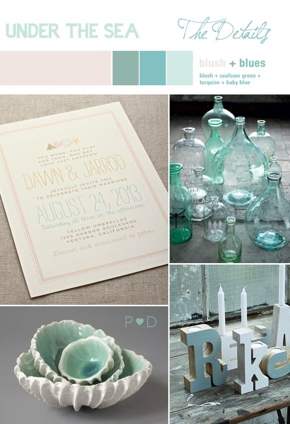
- Get inspiration from your surroundings. A sleek city wedding might use a black and pale pink palette, a sea-side wedding might go for turquoise and sea-glass green. I think the key to making these work is not to overuse the theme - i.e. not using shell motifs on absultely everything with a beach wedding. Don't just get isnpired in terms of colour but also shapes, e.g. the skyline of your city. See city colour and invite inspiration below via Martha Stewart Weddings.

- Think about your own colouring and personality. If any of you have every read anything about Colour Me Beautiful you'll know what I mean! As 80's and throwback as this whole CMB concept might seem, their colour recommendations are quite often pretty spot on. 'Winter' people like me with dark hair and a cool skin tone tend to look good in bold reds, navy blues, ice-grays and whites. And perhaps that's why the whole pastel palette I was originally looking at didn't feel right. I don't think we need to go all colour-police here but after having looked at hundreds of wedding photos online I would go so far as to say that blondes do seem to shine alongside pale pinks, blues and mint greens - and redheads do look stunning with green or red accessories. Basically, I think if you wouldn't wear the colour because it doesn't suit you, don't include it as one of your main palette colours.
- Think about the season. Red, which is one of my colours, is often a favourite for winter weddings (though personally, I'd be concerned about it looking too Santa!) - in order to make red more suitable for summer it helps to combine it with other colours such as orange or pink. Purple also works well in winter. Spring weddings work well with pastels and fresh colours like lemon and mint. Summer screams out for vibrant pinks. And autumn offers a whole load of gorgeous ombre tones - it's just a question of whether or not you'd dare to use them - I wouldn't because ombre and rust tones happen to look awful on me!
- Consider the venue. One of the many reasons I didn't go with a pastel pallete in the ends was our venue. We booked our casa rural via my inlaws without having seen it in person, and while it's a charming venue it doesn't quite have as many trees and flowers as I was hoping for. I was envisioning a country house much like those in the UK, overflowing with blossoms and greenery which would in themself provide the colour scheme - meaning I'd only need to add a few gentle pink touches here and there to merely complement what was already there. Turns out it's actually pretty short on blooms! Instead of throwing a bridezilla the 3rd hissy fit I decided to change the palette to stronger reds, figuring that we'd need bold colours in order to detract from any of the percieved shortcomings of the venue. In contrast a truly stunning venue may be able to get away with an all-white palette which doesn't detract from its beauty, with a winery venue you could draw inspiration from grape tones and with a farm wedding golden hay tones might work. See below for some stunning sea-side inspiration via love my dress - gorgeous. (Would have considered these colours if they suited me!)


2 comments:
Great!!!definitely useful (at least for dreaming meanwhile :) )
Will you be attending Evening Fashion Network in Madrid next tuesday??
Hi Alexandra, no I didn't know about Evening Fashion Network - I'm afraid I'm not very up-to-date on what's going on in the city these days!
Post a Comment